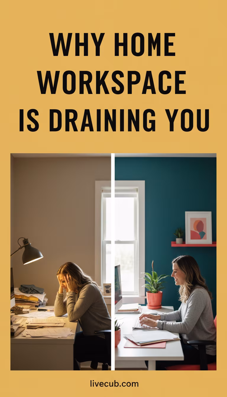
How Color Psychology Affects Your Home Workspace Mood is less about magic paint formulas and more about how color, light, contrast, memory, and task type shape the way a room feels.
Color can support focus, calm, energy, or separation between work and rest, but it does not work the same for every person. A good workspace color plan starts with the job you do, the light you have, and how your body responds across a real week.
Start With Evidence And Limits
Color psychology has research behind it, but simple claims can become exaggerated. A blue wall will not fix burnout, and a red chair will not create discipline by itself.
A review in Color and Psychological Functioning explains that color effects depend on context, meaning, and the specific task. Treat color as one design choice among light, ergonomics, sound, sleep, and workload.
Match Color To The Work
Deep focus tasks often feel better with lower visual noise: muted blues, greens, warm whites, or soft grays with enough contrast. Creative work may tolerate stronger accents because novelty can help the room feel alive.
Administrative work may benefit from clear contrast around screens, notes, and storage. If you spend the day on video calls, test how wall color affects your face, eye strain, and camera exposure.
Light Changes The Color
Paint does not exist apart from light. Morning sun, cloudy afternoons, warm bulbs, cool LEDs, and screen glow can make the same wall look calm at noon and harsh at night.
CDC/NIOSH training material notes that blue light has the strongest effect on circadian rhythms and that white light during the day can affect alertness and mood. Its light and circadian rhythm page is about work hours, but the lesson applies to home offices too.
Use Red Carefully
Red can feel urgent, warm, or energizing, but it can also raise a sense of pressure. In a workspace, red often works better as a small accent than a full-room choice.
Use it where you want a cue: a notebook, lamp base, calendar mark, or exercise corner. Avoid surrounding your screen with a strong red field if you already feel rushed or watched while working.
Blue And Green Are Not Automatic
Blue and green are often described as calming, but shade and saturation matter. A gray-blue room can feel steady to one person and cold to another. A strong green may feel fresh in daylight and flat under weak bulbs.
A recent workspace wall-color study reported different effects by color condition, including lower productivity under one green condition compared with red, blue, and yellow. The workspace wall color study is a useful reminder not to treat color families as guaranteed mood outcomes.
Yellow Needs Restraint
Yellow can add warmth and optimism, especially in a dark room, but intense yellow may feel loud on long workdays. Small accents often work better than full walls.
Try yellow where it catches light without filling the whole visual field: a chair cushion, art, small shelf, or file tray. If it makes you restless, soften it toward cream, straw, or muted ochre.
Neutrals Still Have Mood
White, beige, gray, and black are not neutral to the nervous system. A blank white wall may feel clean, clinical, bright, or empty depending on light and personal history.
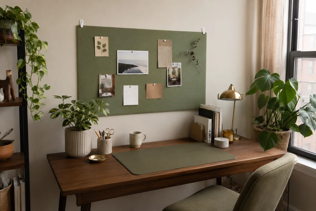
Layer neutrals with texture and contrast so the room does not become flat. Wood, plants, fabric, matte surfaces, and one or two accent colors can make the workspace easier to stay in.
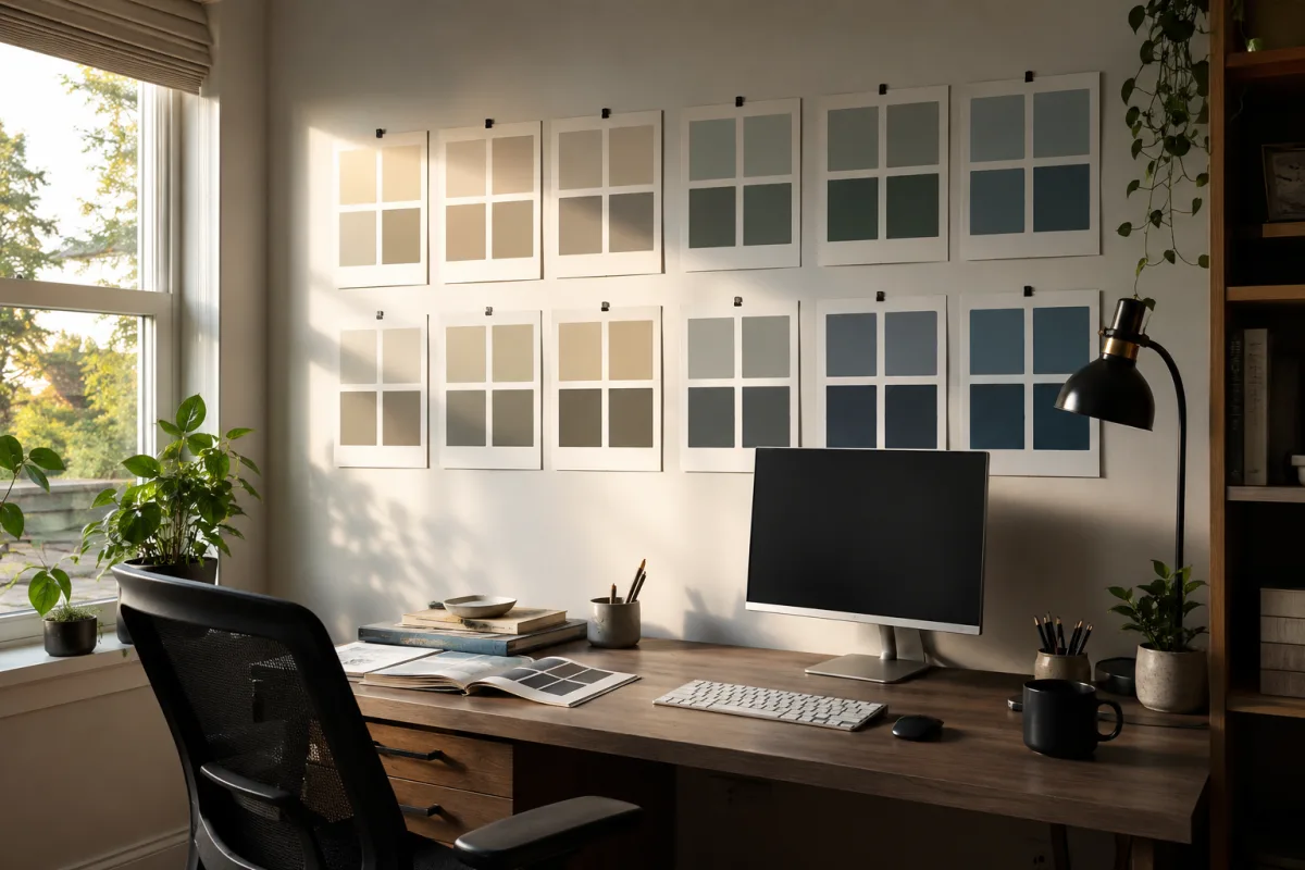
Create Zones Without Repainting
Renters and cautious decorators can test color through movable items: pinboards, curtains, lampshades, desk mats, art, storage boxes, and plants. This lets you observe mood before committing to paint.
Track your response the way you would track a habit. Livecub's food journal guide is food-focused, but the same daily notes can capture focus, irritability, energy, and headaches after color changes.
Support Stress Regulation
Color choices should support the way you handle pressure. If work already pushes you into performance anxiety, choose a background that lowers visual threat rather than one that shouts productivity.
For related pressure moments, Livecub's stage fright guide and sports tryout nerves article show how body state affects performance long before logic catches up.
Think About Age And Sensory Needs
Older adults and people with low vision may need stronger contrast and reduced glare. Neurodivergent workers may prefer lower saturation, predictable patterns, or clear color coding that reduces decisions.
If you are adjusting a workspace for an older family member, Livecub's elder motivation guide is not a design article, but it reinforces the value of dignity, choice, and personal preference.
Make A One-Week Test
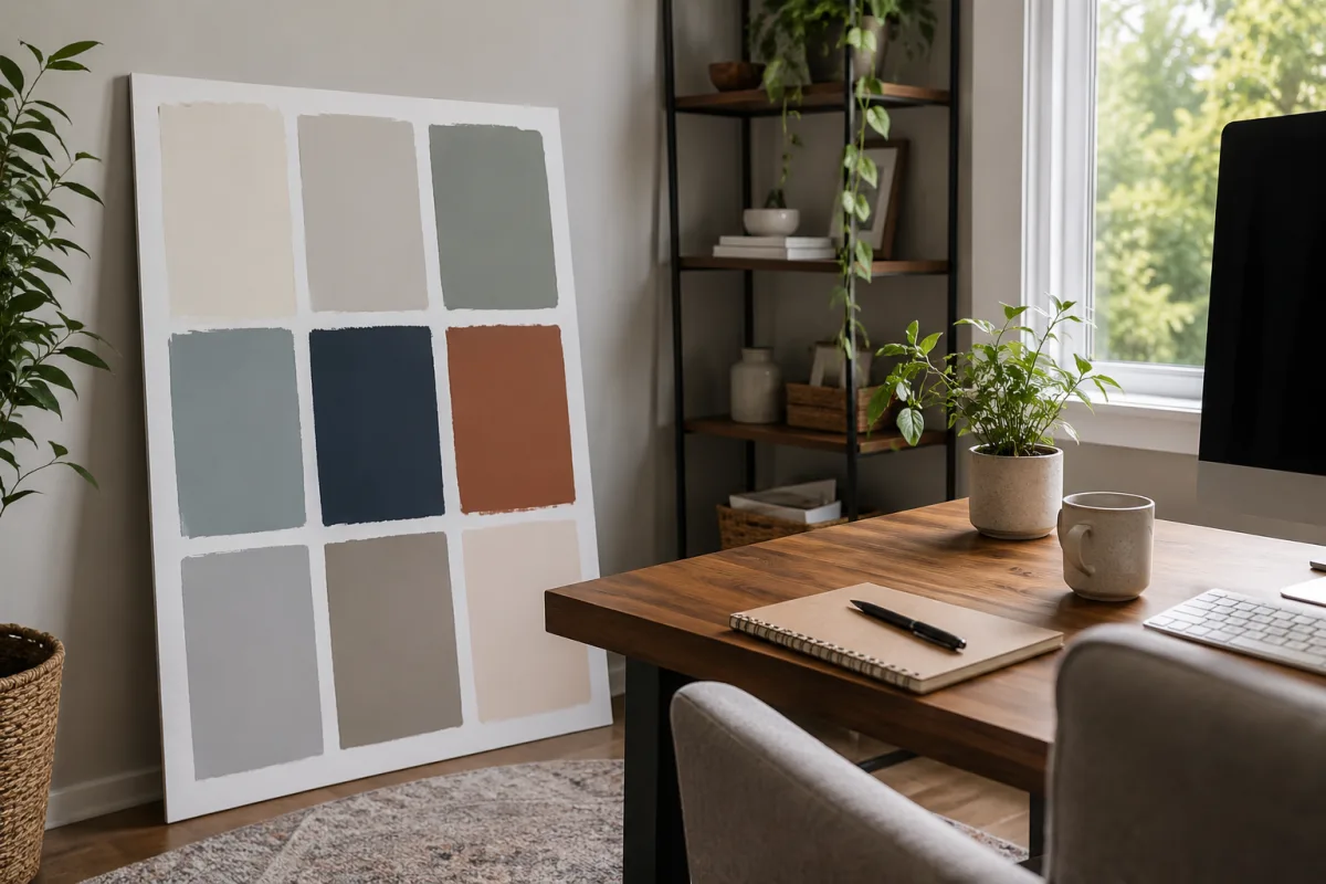
Before repainting, place a sample board where you will actually see it: behind the monitor, to the side, and in camera view. Check it morning, afternoon, and night.
During the week, note focus, eye comfort, mood, screen glare, and whether the room helps you stop working at the end of the day. A color that looks beautiful online may fail if it keeps your mind switched on after hours.
Practical Palette Ideas
For calm focus, try warm white walls, muted blue-gray accents, natural wood, and one living plant. For energy, use a neutral base with yellow or coral accents away from the monitor.
For a small room, use one quiet wall color and add contrast through desk tools. For a shared room, use color to mark the work corner without making the whole household feel like an office.
Screen Backgrounds
The wall behind your monitor affects contrast and eye comfort. A very bright wall can create glare, while a very dark wall can make the screen feel harsher in a dim room.
Try a mid-tone background if your eyes tire quickly. The best choice is the one that lets the screen stay readable without forcing your eyes to fight the room.
Video Call Color
Video calls make wall color part of how others read you. A strong color behind your head can cast light onto skin or distract from your face.
Test your camera before painting. Sometimes a quiet background with one warmer accent looks better than the color that seemed exciting on the paint card.
Texture Changes Mood
Texture softens color. A matte wall, woven shade, cork board, fabric panel, or wood shelf can make the same palette feel warmer and less flat.
This is helpful in small home offices where one wall color covers most of the view. Texture gives the eye a resting place without adding clutter.
Season And Time
A color that feels focused in July may feel gloomy in January if daylight drops. Workspaces used at night may need warmer lamps and softer contrast than rooms used only in daylight.
Check the room at the hours you actually work. A paint color chosen on a sunny weekend can behave differently during a gray weekday deadline.
Shared Spaces
If your desk sits in a bedroom, kitchen, or living room, color has to serve more than work. Too much office energy can make it harder to rest or share the room after hours.
Use movable color to mark work time, then close a laptop, turn off the task lamp, or cover the desk tray so the room can return to home mode.
Avoid Overdesigning
A workspace can become so planned that every object feels like a productivity demand. Leave some visual quiet. The room should support work without staring back at you.
If a new palette makes you feel judged, restless, or unable to stop tweaking, simplify it. Comfort is a valid design result.
Frequently Asked Questions
What color is best for a home office?
There is no single best color. Choose based on task, light, personal response, contrast needs, and how long you spend in the room.
Are blue and green always calming?
No. Shade, brightness, lighting, culture, and personal memory change the effect. Test real samples in your own room before painting.
Can red improve productivity?
Red may increase urgency for some tasks, but it can also feel stressful. Use it as a small accent if you are sensitive to pressure.
Does lighting matter more than wall color?
Often it matters just as much. Daylight, bulb temperature, glare, and evening screen light can change both mood and how color appears.
How can renters use color without painting?
Use curtains, art, desk mats, storage bins, removable panels, lampshades, plants, and small accent objects that can move with you.
Color psychology works best when it stays practical. Test small, watch your body, adjust the light, and build a workspace that supports the kind of attention your work actually needs.
Olivia Prete
Edits culture and personal-development articles, distinguishing opinion and experience from verifiable claims.


Leave a reply
Replying to